Important Logo Contest

D

Deleted member 1

Guest
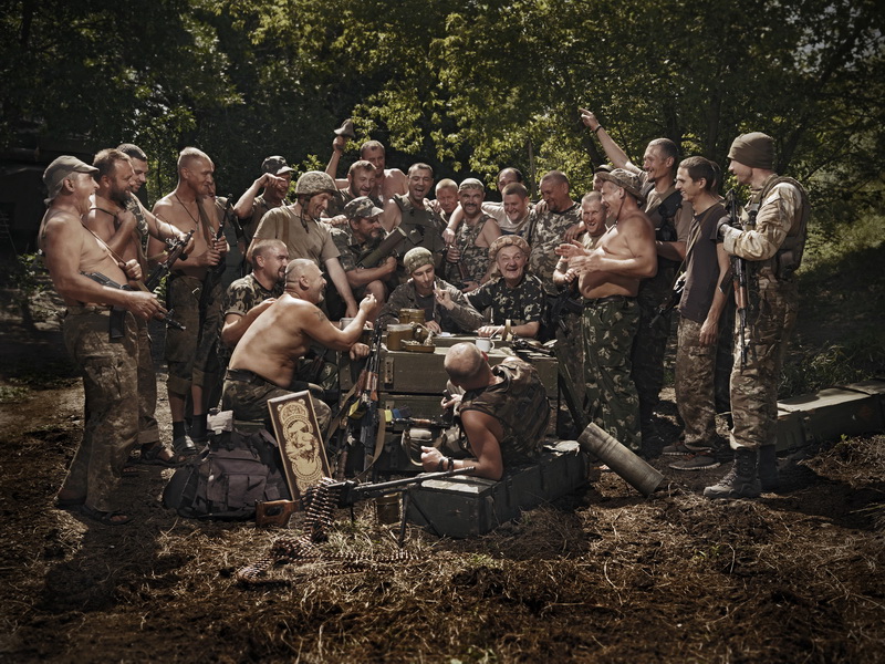
Everyone, we are holding a logo contest! The prize will be a free premier “Hetman” subscription for the next year. We would very much like to see a competition for a permanent logo and a site banner as well. Both should reflect the them of cossacks and/or Fremen and you must give all rights to the Sietch and everything must be your own or in the public domain. You will all have until 7 September to complete and offer a final design for the logo, header, etc, to give our board a unique identity. Rung ho, and have at, gentlemen!
 
Last edited by a moderator:

Lightershoulders

Just another, seeking.
Ok, so the name of the website is paying homage to Dune as far as I can tell, and google tells me that Sietch mean community or village. So a Haven sort of fits with that symbolism.

Any plans on more styles? A logo should look good on all style option.
 

Es Arcanum

Princeps Terra
Founder
My thoughts were running towards using the same distinctive font that the Dune movie used Font Family Page called Albertus font, but its a commercial font and I'm not sure what the legalities are for its use in a website banner.
273179.png


Likewise I am unsure about any possible use of the famous Cossack painting though it would appear to be public usage, it would be cool to have that painting associated with the site as it has become a meme in itself. :D
Ilja_Jefimowitsch_Repin_-_Reply_of_the_Zaporozhian_Cossacks_-_Yorck.jpg

IbHjhRb2SYvxoK99k5ni7cbHepNiK8ZQNuIt9byipro.jpg


EUFylgk.jpg

OWzGa4t.jpg

Youry_Bilak-Letter_Sultan_0229-3000.jpg

BTW any such ideas I have would only be implemented using shitty mspaint and poorly so please everyone feel free to use these ideas if you like, I just want this place to have a cool forum banner. :cool:
 

GooseActual

We go hard on Earth!
I had two ideas, good or bad, here they are!

1: the general shape of the Ark from halo3. Not sure if that falls into trademark territory but I wasn’t sure how else to personify a haven, but what is an ark other than a mobile haven? Also space and sci fi related which is why we’re all here in the first place. Just the general shape. No details.

2: a drum with a gavel on it. May be a bit tongue in cheek but as it is a drumhead that landed us here initially why not own that shit?!

Just some ideas I had while driving home!
 
D

Deleted member 1

Guest
To combine the themes of Dune and the Cossack Painting, the artwork style of the failed The Mandate kickstarter game would be perfect. Perhaps someone could stylize The Reply (the Cossack painting) into an idealised form. I think the font is acceptable, if not copyrighted, regardless.
 

Lightershoulders

Just another, seeking.
Orthodox Herbertarian and (as Es Arcanum said,) Albertus Chiseled Serif typeface are the two modified fonts closest to that of Dune. Both are modified fonts from the DUNE 2000 game using examples from DUNE as well.

Neither, from my brief search, are copyrighted.

I'll give it a crack and see what I come up with. You've given a fair amount of time.

Not sure about the art style of The Mandate, to be honest this is the first I have ever heard of that.
 

Eagle One

The Mad Professor
Other information that is necessary... What are the dimensions we are working with? I'd like to know both the logo and the banner dims, please.
 

*THASF*

The Halo and Sonic Fan
Obozny
Oh my god, @Es Arcanum, you had the same exact idea that I did, right down to the same exact Ilya Repin painting. :ROFLMAO:

I'm not at my rig, just this dumb laptop with no Photoshop, but I'll post a banner-ized version of that pic later.

EDIT: Alright, here we go:

FV8xq6H.png


The font is RM Albion and it's marked free for commercial use:

 
Last edited:

UltimatePaladin

Well-known member
Hm.

Eh. Might as well give it a go.

I'm a fan of simple designs versus complex ones. The main thing I was inspired by was the shape of the columns of Sietch Tabor. I've got a vague idea that I want the name to be in between those columns, but something seems missing to me. Thoughts?

Tr99xVb.png
 

UltimatePaladin

Well-known member
Trying something else.

dkf2Wj9.png


Abandoned the columns from the original idea. Capitalized "The Sietch", making the text stand out a little more. The biggest change here was that I added in a sort of "S" shape line, separating the two words.

I like this one a little better (doesn't have as much empty space as the previous one,) but I feel like I'm stealing this from something. Thoughts?
 

FriedCFour

PunishedCFour
Founder
Yes, we also need a site banner, and the reward is a year’s free Hetman subscription.
Just so that's clear that means you get your own private subforum on top of all other benefits.
 
Last edited by a moderator:

Users who are viewing this thread

Top