Humor/Comedy Bad city flags in the US (also Best and worst flags in general)

Carrot of Truth

War is Peace
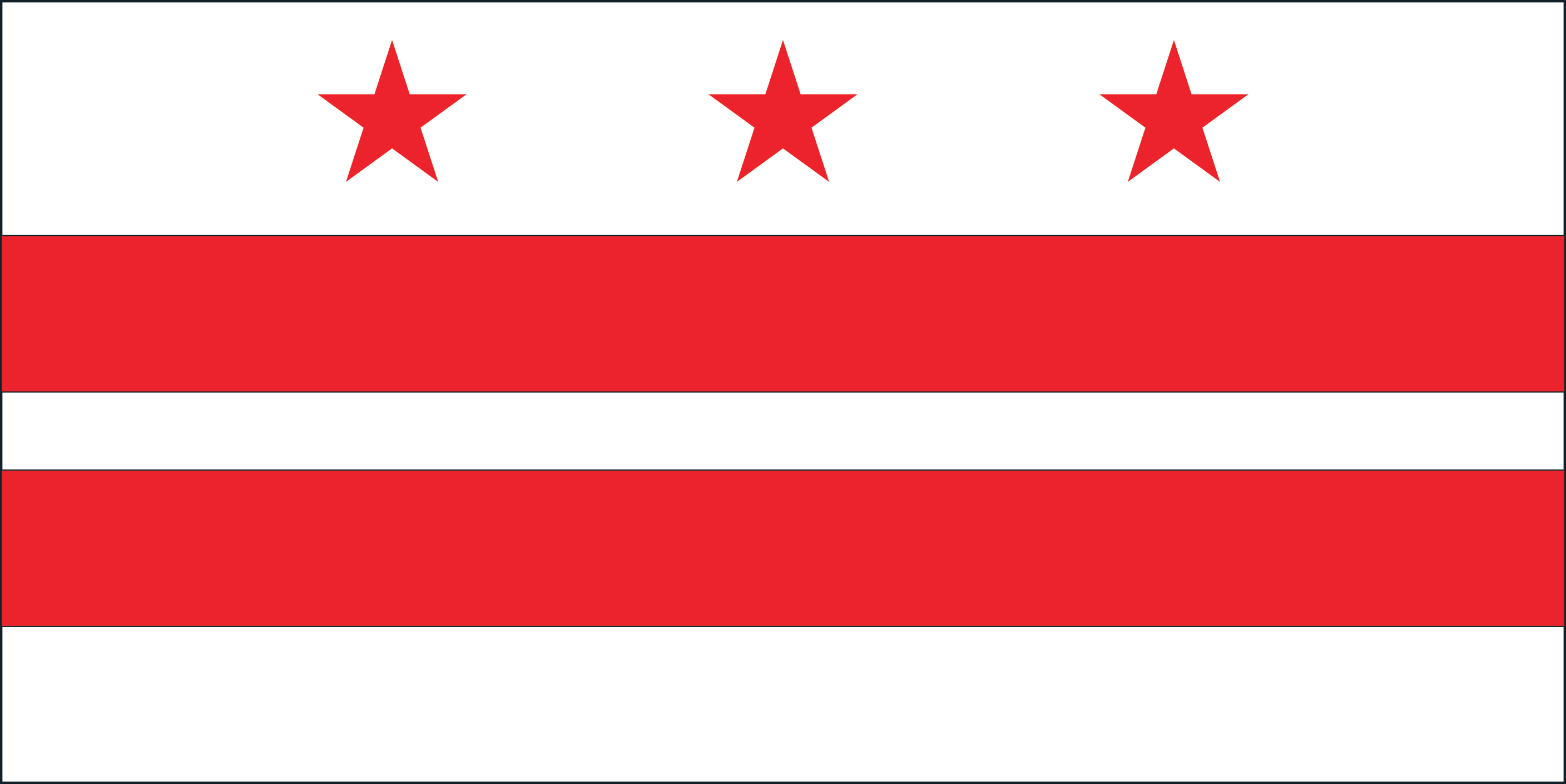
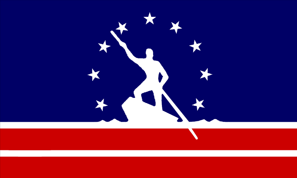
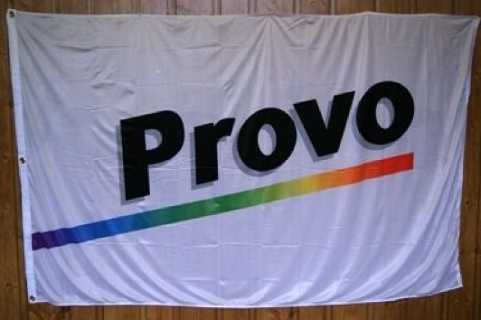
So I was watching this video and it made me realize how terrible US city flags are, It got to me to wandering about some of the worst offenders.


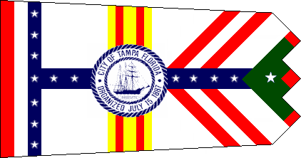
The first offender I have found is San Francisco


i6J3yOQ.jpg


Whats particularly notable about this flag is that it does actually have some potential but the giant text just ruins it.


tlAZLvP.jpg


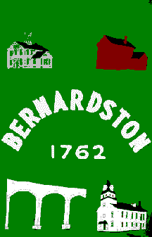
But this Pueblo, Colorado flag here is an outright abomination that needs to be burned and forgotten.
 

Buba

A total creep
American city flags are terrible by default, being designed by people who had never heard of the rules of heraldry. And give off Soviet heraldry vibes, for some reason.

San Francisco - it is verbotten to have white/silver and yellow/gold next to one another!
Pueblo? Is that the logo of a TV station? Splash screen for a sitcom?!?

The horror! The horror! It cannot be unseen!
 

Buba

A total creep
[peeks through fingers]
Yes, with a tasty sickle here and a dainty hammer there Milwaukee would fit right in among Cities Heroes of the Soviet Union ...
 

Carrot of Truth

War is Peace
I'd say Milwaukee is trying too hard. They apparently made their flag by committee or something and tried to get representation for every last imaginable group and industry in there somewhere.

iu


Yeah there is no fixing that flag, Its just way too damn busy. It looks like a meth addict was given paint and told they would be rewarded with a pound of meth and they then proceeded to try way too hard.
 

49ersfootball

Well-known member
I'd say Milwaukee is trying too hard. They apparently made their flag by committee or something and tried to get representation for every last imaginable group and industry in there somewhere.

iu
City Flags that need some update:
1.) Atlanta, GA
2.) Memphis, TN
3.) Birmingham, AL
4.) New Orleans, LA
5.) Charlotte, NC
6.) Baltimore, MD
 

S'task

Renegade Philosopher
Administrator
Staff Member
Founder
Just to remind people, not all city flags are bad.

The Flag of Washington DC for instance:
dcflag.jpg


Richmond VA has a decent flag too:
us-va-ri-l.gif


That said, most city flags in my area are plain field with city seal on them... which, well, can't really say much since Virginia's flag is that boring field with State Seal on it, the only redeeming factor is that Virginia's State Seal is probably the most badass state seal in the country.
 

Carrot of Truth

War is Peace
Just to remind people, not all city flags are bad.

The Flag of Washington DC for instance:
dcflag.jpg


Richmond VA has a decent flag too:
us-va-ri-l.gif


That said, most city flags in my area are plain field with city seal on them... which, well, can't really say much since Virginia's flag is that boring field with State Seal on it, the only redeeming factor is that Virginia's State Seal is probably the most badass state seal in the country.


My hometown doesn't even have a city flag. Richmonds flag does look pretty good though.
 

Bear Ribs

Well-known member
My hometown doesn't even have a city flag. Richmonds flag does look pretty good though.
Richmond's pretty decent. Washington DC... that would be a good capital city flag for Canada, not the US.

I don't think we've brought up the joy and wonder that is Tampa's flag yet.

TampaCityFlag.PNG


Too many colors, too many varying stripe patterns running in different directions turning it into a mess, the embroidered center seal clashes badly with the rest of it, and due to its odd tapered shape coupled with a sawtooth end, it's exceedingly hard to make or even draw and can't be readily adapted into other shapes like banners.
 

Carrot of Truth

War is Peace
Richmond's pretty decent. Washington DC... that would be a good capital city flag for Canada, not the US.

I don't think we've brought up the joy and wonder that is Tampa's flag yet.

TampaCityFlag.PNG


Too many colors, too many varying stripe patterns running in different directions turning it into a mess, the embroidered center seal clashes badly with the rest of it, and due to its odd tapered shape coupled with a sawtooth end, it's exceedingly hard to make or even draw and can't be readily adapted into other shapes like banners.

That flag is genuinely awful, Like why is flag design so bad in US cities? I guess because a lot of these are probably picked by the old boomers who actually go to town hall meetings and they probably give the flags no more than 30 seconds of thought.
 

Bear Ribs

Well-known member
That flag is genuinely awful, Like why is flag design so bad in US cities? I guess because a lot of these are probably picked by the old boomers who actually go to town hall meetings and they probably give the flags no more than 30 seconds of thought.
Being fair, mostly it's because we're looking at the worst city flags, and the US has tens of thousands of cities so there's going to be some real stinkers in there. Just for fairness' sake I'll include a non-US city here.

Personally, I hold Tampa and Milwaukee as the worst city flags but here's a few runner-ups:

768px-Flag_of_Grand_Rapids%2C_Michigan.svg.png

Grand Rapids couldn't figure out how to make a flag that said "Our only industry was furniture manufacturers and they're all closed" so they decided Zombie Pacman was a winning flag.

1920px-Flag_of_Lethbridge.svg.png

Lethbridge, AB, Canada's flag. They clearly wanted an American flag to piss off the rest of Canada but then why make that monstrosity out of it?

us-mabns.gif

Okay Bernardston, first off that's not how flags are supposed to be shaped. Second, flags aren't supposed to be a big mass of clipart. Third, your colors don't work, the one spot of brick red wrecks what would otherwise be a coherent color scheme.

1410475692329204650.jpg

In fairness, Provo has changed their flag since, this was their old one. But seriously, somebody just ripped off the Centrum logo. This is the kind of flag you might get from a 4th grader with a copy of photoshop and a fifteen-minute deadline.

us-maley.gif

Leyden followed Bernardston's example in making their flag the wrong shape, then went with an abstract design that appears to have been inspired by the contents of a dirty diaper after the baby ate an entire Play-Doh collection. I imagine this thing flapping in the wind could cause actual seizures.
 

Users who are viewing this thread

Top